
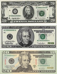
The Bureau of Engraving and Printing tries to redesign currency every 7-10 years to foil counterfeiters. From top: pre-1996 currency; redesign from 1996-2004; current design. (Waileia illustration)
Today, the newest style of U.S. currency makes its debut in cash registers, ATMs, and wallets near you. The new $20 bill is arguably the most dramatic change of design in the history of American money.
The new money maintains the familiar portrait of Andrew Jackson, but that’s where the similarities end. The most recognizable change is the departure from the characteristic “greenback” look that has characterized U.S. currency for most of its 142-year history. Instead, the new bills support a rainbow of greens, peaches, and blues, making the new money look a lot like offerings from other countries.
In addition to the color, the new bills omit the characteristic oval backdrop, instead blending the portrait into the border. An eagle and the words “USA TWENTY” are printed on the background. Small, yellow “20” numerals appear on the back.
With all the changes, a lot is staying the same. Many of the elements, including the signatures, “Federal Reserve Note,” and other features remain, as do the embedded plastic security strip, watermark, and color-changing ink. The back of the bill also looks very similar to the previous series.
Today, officials from around the country (though apparently not in Hawai’i) took place in formal ceremonies to put the first of the new bills into circulation. The lucky first businesses included Burger King, Ace Hardware, and, of course, Starbucks.
Since it will likely be some time before the new currency reaches you, the Bureau of Engraving and Printing has been kind enough to “upload” an interactive bill. You can take a look here* [Flash required] (though, alas, you can’t spend it).
* LINK TENDING 1/11 – Removed dead link.